.
Photography and Text by Isabel Zapata, Copyright 2016
.
MEMRI
Founded by Isabel Zapata, MEMRI is a concept that arose from the collective mindset of the youth of this generation. Fashion, it its very essence, is an expression of individuality, and MEMRI, at its very core, advocates for this. Now more than ever, the freedom of self expression must stand in the face of political turmoil. As not only a reflection of individual expression, MEMRI recognizes the inherent power that lies in the hands of the young generation and the value that has on the future.
The inspiration has always been here, right in front of us all. By creating individual, customized pieces rather than collections, MEMRI seeks to bring that special night to the next level. The perfect cocktail dress for your next night out with the girls, or a new top notch tie for your upcoming date.
MEMRI is iconic. It is the symbol of empowerment, youth, and fun. Make memories, make history.
Together we can change the world.
.

.
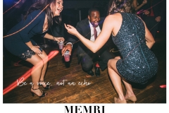
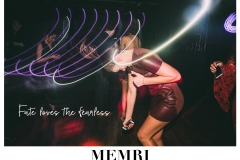
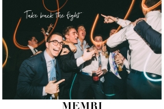
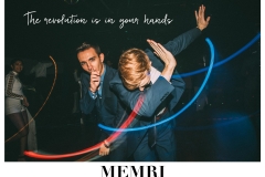
Fashion, in its very essence, is an expression of individuality. When we were asked to make this assignment political, there were various directions I was thinking of taking the project, but I ultimately settled on something that hit close to home. With the recent election results, I feel that the youth of this country were hit the hardest. I wanted my ads to reflect a brand that advocated not only for youth activism and political change, but also advocated for the freedom of self expression and individuality. With a few fraternity formals that I photographed this past weekend, I specifically went into them looking for shots that I could use for these ads. To me, capturing students having fun and being uninhibited by daily societal constraints seemed to be the purest form of expressing this brand idea for a fashion company that makes suits and cocktail dresses.
As for the actual design of the advertisements, I came at it from a few different angles. As far as brand name, I thought about different aspects of having a good time at a party and going out with friends and ultimately came up with the idea of a memory. Usually great memories are made on nights where people dress up and go to an event together, which is why I thought the name of the brand should be a spin off of “memories”. Furthermore, I wanted the font to reflect that of a higher end fashion company since nice cocktail attire is usually pretty expensive. I chose to capitalize and bold the font to reflect the same kind of style that I had seen in higher end fashion magazines. However, I definitely wanted to incorporate youthfulness and fun as well, so I designed the ads to reflect a polaroid print. To me, a polaroid print is an iconic symbol of youth and making memories with friends. The placement of the photo within the background has the same dimensions as a polaroid print, and I chose to incorporate handwritten-styled font to mimic the handwritten captions that are often written on polaroids. I also chose to use captions to tie in encouraging and empowering messages to better present the political context of the advertisements.
.
About The Author: Isabel Zapata is sophomore enrolled in the College of the University of Pennsylvania, Class of 2019. To read additional articles by Isabel Zapata, go here: https://tonywardstudio.com/blog/isabel-zapata-girls-girls/


