Photography and Text by Lilibeth Montero, Copyright 2018
.
Book Review
.
John Szarkowski: Looking at Photographs
.
The first picture John Szarkowski introduces is a portrait. The portrait created by William Shew, using the daguerreotype process, fascinated me. Szarkowski mentions in the book that daguerreotype was mainly used to capture the faces of people. I find this early usage of photography similar to the current most popular use of photography, to take “selfies”. Although, it’s incredibly narcissistic to take pictures of one self, oddly we are capturing our history just like the people taking pictures using the daguerreotype technique were. I also find it important to note that I feel photography has become heavily flooded my narcissism, and I feel that’s the direction new photographers emerging will perhaps take.
Another image I found quite fascinating was “Chicken and tree” by Edouard Boubat. The way Boubat plays with the viewer’s perspective is incredible. At first sight, I was sure this image was of a tree and chicken, and the sky behind it. To my surprise there is a wall behind the tree. I find this image fascinating because one can understand the technical process that went into producing an image like this, but it’s still incredible. I really agree with what Szarkowski says, that our interpretation of an image may change but the image itself doesn’t. After reading, I realized there was a wall, however I still saw a sky behind the tree. On the other hand, Baron Adolph De Meyer’s image “Helen Lee Worthing” is fascinating to me because of the “frank and luxurious artificial light” within the image. I feel this light makes the image look much more luxurious, and conveys a sense of wealth. I find it interesting how Baron Adolphe De Meyer influenced fashion, and how technological improvements allowed him and other photographers have a larger platform.
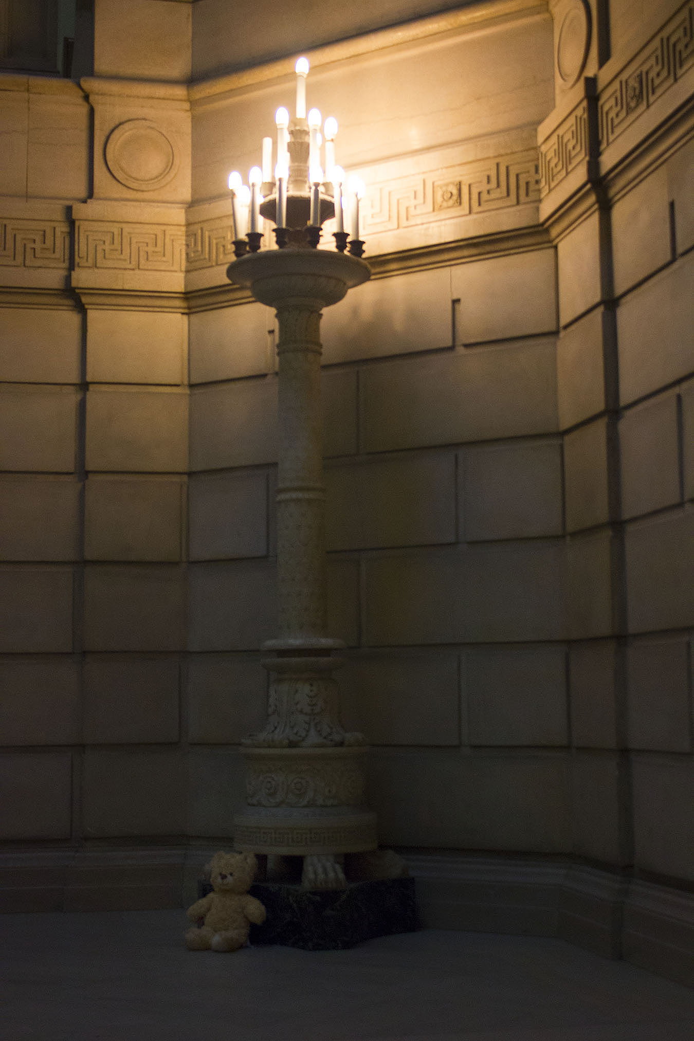
In my image, I attempted to mimic the way Boubat deceives the viewer in his image. I decided to take a picture of a lamp, but added a teddy bear to the bottom of it. I wanted the bear to be out of focus, and the purpose of the teddy bear is to change the interpretation of the image, yet have the image be the same. Although it’s not the same way Boubat fools his audience, I am very pleased with the result. When you don’t notice the teddy bear one focuses on the lamp asking questions like: why this lamp post? Where is this lamp post located? After noticing the teddy bear one’s interpretation changes and the viewer asks questions like: why this lamp post and this teddy bear? How do they relate? Similar to Baron Adolphe De Meyer’s image, my picture portrays a sense of luxury through the light released by the lamp. The lamp post itself aesthetically conveys a sense of wealth because of the careful details embedded in the stone, the marble at the bottom it and the chandelier looking light bulbs.
.
About The Author: Lilibeth Montero is a freshman enrolled in the School of Nursing, University of Pennsylvania, Class of 2021. To access additional articles by Lilibeth Montero, click here: https://tonywardstudio.com/blog/lilibeth-montero-abril/